How to Introduce Subtle Spring Colour into a Neutral Home
February rarely arrives with sunshine and bloom.
But it does bring a quiet urge for what’s to come, a glimpse of spring, even if it hasn’t fully arrived yet.
Even before the season changes, we begin craving lightness. Subtle colour. Softer tones. Pieces that gently brighten our everyday spaces without overpowering them.
This February Edit is where we focus on how to introduce colour into your home in a softer, more balanced way, especially within neutral or already furnished spaces.
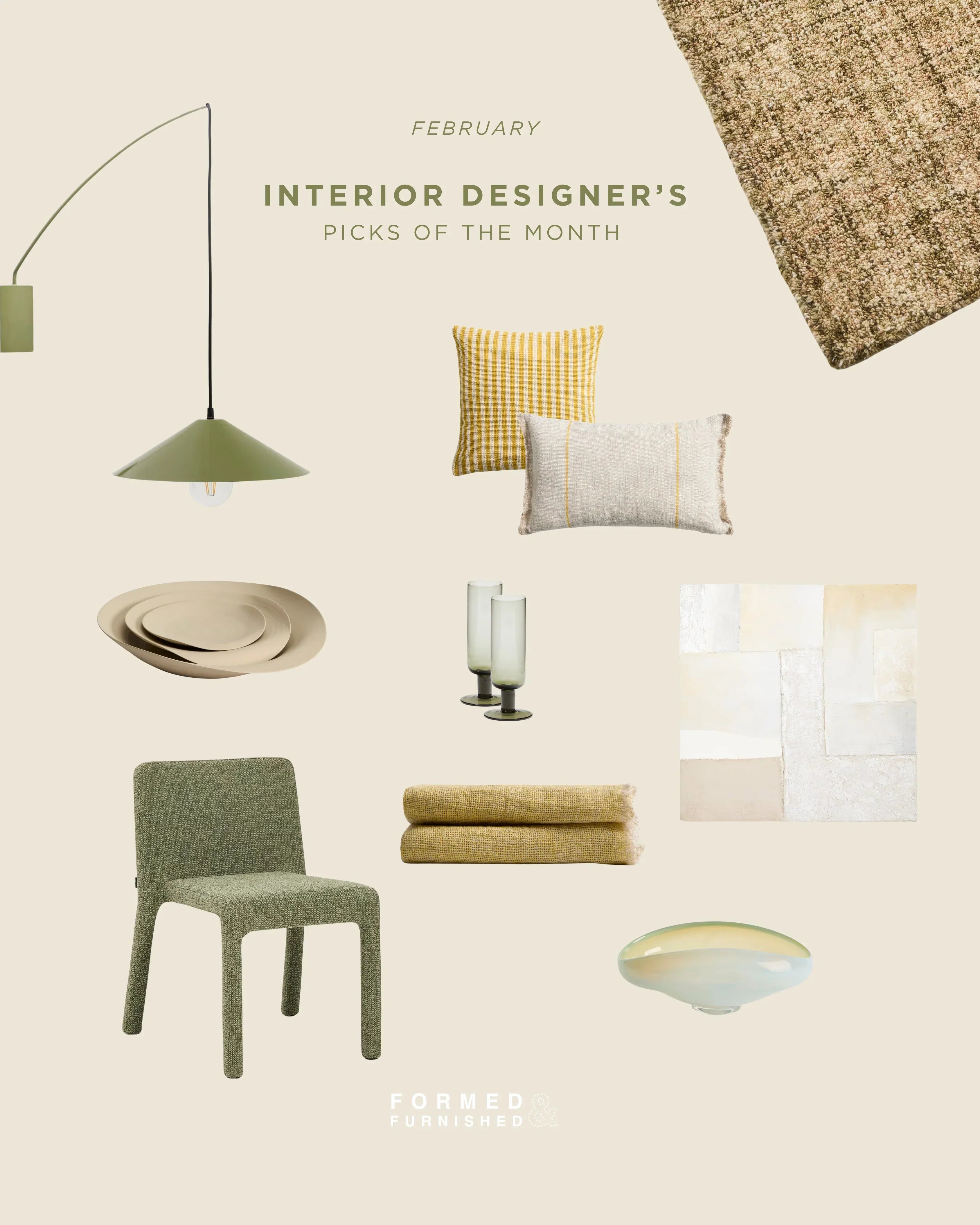
A simple rule of thumb? Work with a controlled palette. Choose two or three tones and repeat them across materials and textures throughout the room. In this edit, we build around muted green, warm beige, and soft yellow, a combination that feels subtle and spring-like, yet refined enough to carry through into summer.
Below, you’ll find a curated selection of pieces that demonstrate how to bring this palette into your home through layered textiles, sculptural forms, and carefully chosen accents that work together rather than compete.

Dirome Yellow Striped Cushion Cover (Affiliate link)
A woven yellow striped cushion that introduces warmth to beige sofas and neutral living rooms. This is how to add colour to a neutral space without overwhelming it, through pattern and texture rather than saturation.

Licore Beige Linen Cushion Cover with Yellow Detail (Affiliate link)
Natural linen with a fine yellow accent stripe. The neutral base keeps the palette calm, while the detail adds a refined seasonal lift, ideal for layering in spring home decor.

Ebenor Beige Ceramic Centerpiece (Affiliate link)
An organic beige ceramic bowl that anchors the palette. Every colour story needs grounding elements, this piece keeps the overall look cohesive and elevated.

Pineda Abstract Canvas in White (Affiliate link)
Textured neutral wall art that connects the entire colour scheme. The layered tones subtly reflect both green and yellow accents, creating visual continuity across the space.

Zarn Mini Bouclé Wool Blend Rug (Affiliate link)
A wool blend rug in warm beige with soft green undertones. A foundational piece that integrates colour gently into the room while maintaining a calm, neutral interior aesthetic.

Loria Green Chenille Stackable Chair (Affiliate link)
Muted green upholstery in a tactile chenille fabric. Colour introduced through material depth rather than brightness, perfect for dining areas or accent seating in modern interiors.

Aderin Yellow Linen Blanket (Affiliate link)
A lightweight yellow linen throw that brightens sofas or beds. An effortless way to refresh your home for spring while keeping your overall palette soft.

Kally Green Wall Lamp (Affiliate link)
A sculptural green wall lamp that adds vertical colour and architectural interest. Lighting is one of the most effective ways to incorporate subtle seasonal updates into your home.

Nodila Glass Centerpiece (Affiliate link)
Translucent white, yellow and green hues in glass that reflects natural light and reinforces the neutral base. A balancing element within a warmer spring palette.

Sauky Green Tall Wine Glass (Affiliate link)
Green-tinted glassware that carries the colour story into smaller styling details. Thoughtful repetition is what makes a palette feel intentional.
Bringing It All Together
Colour doesn’t need to be bold to be effective. Often, it’s the quiet interplay between tones that gives a room depth and intention.
When you layer similar tones across different materials such as upholstery, textiles, glass, ceramics, they begin to blend naturally into the space. Even small additions can shift the atmosphere without disrupting the foundation you’ve already built.
Choose colours you’re drawn to, apply them with consistency, and you’ll find that a home evolves most beautifully in nuances.
Images via Kave Home

