


A room without contrast is just a room. But contrast without harmony is just noise.
That's the distinction this edit is built around, not pieces that match, but pieces that belong together despite their differences. Soft against hard. Warm against cool. Organic against structured. Each tension is intentional, and the result is a room that feels both alive and at ease at the same time.
I was watching the Swedish renovation TV show recently and a designer couple in Copenhagen said something I actually remember coming across whilst studying, that when you design something, it should feel 10% ugly. Not wrong. Not broken. Just a little imperfect. A little rough. Something that doesn't quite fit the "perfect" version of the room.
And it's one of the truest things about interior design or design in general. Because when everything is safe and beautiful and perfectly matched, it goes flat. But when something has a bit of tension, a texture that's too raw, a shape that pushes slightly too far, suddenly the whole room comes alive.
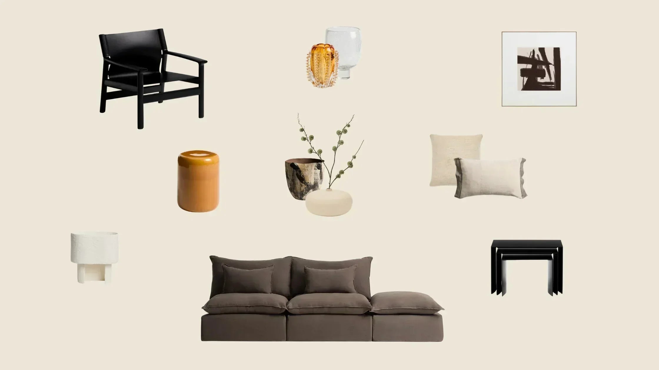
That's exactly this edit. A dark brown linen sofa that almost clashes with the black wooden armchair. Shiny glazed ceramic in amber next to rough hand-painted stoneware. Glass vases in different finishes, even though they're all the same material. And a few wild thistle branches that have no business being in a room this considered and yet....it works.
Nothing matches. Everything belongs. Below are the pieces we chose for March and why the relationship between each one is the whole point.
Contrast in Harmony

Anarela Taupe Linen 3-Seater Modular Sofa with End Module (Affiliate link)
The soft anchor, a modular sofa in washed linen with a removable cover and invisible-effect legs that sits in deliberate tension with every harder, darker piece around it.

Jan Armchair in Black Recycled Leather and FSC 100% Solid Ash Wood (Affiliate link)
The structural counterpoint, black recycled leather in an exposed solid ash wood frame that makes the whole room feel designed the moment you place it in a space.

Litto Set of 3 Black Lacquered MDF Nesting Tables (Affiliate link)
Three tables in one graphic black finish that connects them visually to the armchair, creating a thread of dark contrast that ties an entire space together.

Mesquida Ceramic Side Table in Glazed Mustard Finish, Ø35cm (Affiliate link)
The almost single warm accent in a near-monochrome palette without it the room tips cold, with it everything balances.

Disea Beige Linen Cushion Cover with Black Striped Detail, 40×60cm (Affiliate link)
A beige linen cushion with a fine black stripe edge that quietly bridges the soft sofa and the dark armchair in one small detail.

Machiel Cushion Cover in Beige and White Viscose Jacquard, 50×50cm (Affiliate link)
Paired with the Disea, this textured viscose jacquard square shares the same colour family but contrasts in weight and weave, the variation that makes cushions look chosen rather than bought as a set.

Arilan Hand-Painted Abstract Picture, 100×100cm (Affiliate link)
Dark gestural marks on a light background that carry the contrast principle to the wall and tie every black accent in the room together.
Dirva Brown Ceramic Vase, 38cm (Affiliate link)
Dark, hand-painted and organic and everything the smooth, clean pieces beside it are not.
Nivala White Papier-Mâché Vase, 15.5cm (Affiliate link)
Its opposite in every dimension, small, white, smooth and low, making the two together a study in contrast at the smallest scale.

Nicora Orange Glass Vase, 23cm (Affiliate link)
A warm amber glass vase that adds translucency to the grouping and echoes the mustard tone of the Mesquida side table.

Sirau Clear Glass Centrepiece, Ø24cm (Affiliate link)
A clear glass piece that steps back from the grouping entirely, and in doing so gives every other object around it room to breathe.

Bedala White Papier-Mâché Table Lamp (Affiliate link)
A sculptural white lamp whose organic form sits in direct contrast to the harder lines around it.
Link to full Wishlist (Affiliate link)
Contrast in harmony isn't about matching, it's about belonging. The pieces in this edit don't agree with each other. They complement each other, and the tensions between them are what give the room its depth.
You don't need to understand design theory to use this. You just need to notice what feels right when you walk into a room and then ask yourself why. That's what this edit is here to help with.
Images via Kave Home.

